

 11:17
11:17
 Vidi Okta Deadpool


Step 13
We are now going to Add a tinge of blue to the background. Add another ‘Colour Balance’ adjustment layer (Layer > Create New Adjustment Layer) and and a hint of both blue and green.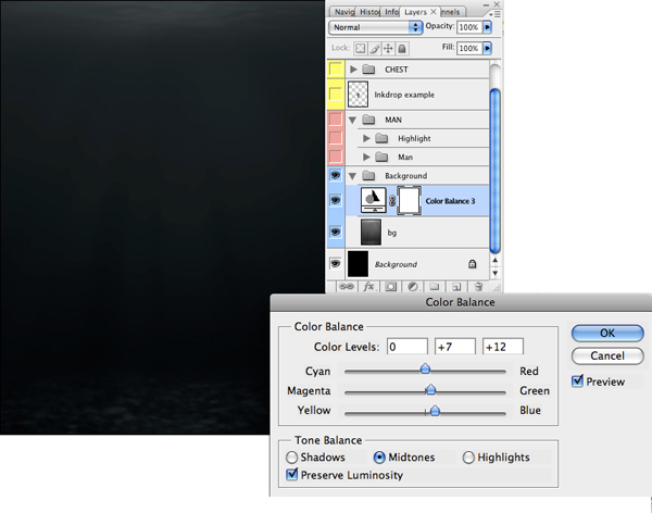
Step 14
To help give the piece some mood, use a large soft black brush to draw a vignette around the outside of the image. Then use a soft white brush to add a glow behind and above the "Man." Make sure to be subtle at this stage, as you want it to look as natural possible.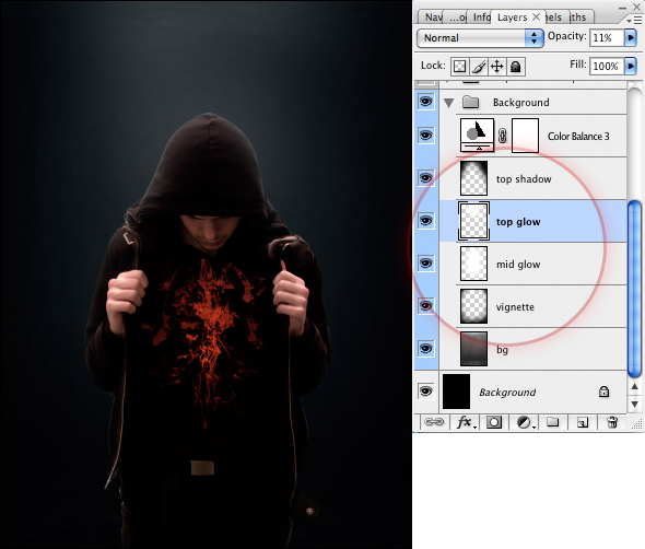
Step 15
We are now going to produce the inkdrop background. First, draw a black triangle, as seen in the image below.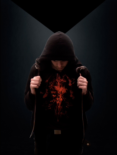
Step 16
Next, paste the ink drops in you want to use. Change the Blending Mode of the layers to Multiply, so we are left with just the black of the images. This again is about choosing the right drops for the best composition.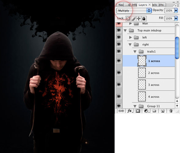
Step 17
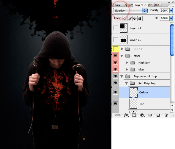
We are finally going to add the red inkdrop falling from the top. Choose the image you want to use. Then import it to the main document, using the same techniques as in Step 6.Create a layer, and using the Rectangular Marquee tool drag a rectangle that covers the single inkdrop. Draw a rectangle over the inkdrop you just chose. Fill the rectangle with the color #912020. Then change the Blend Mode of this layer to Overlay.

 Posted in: Tutorial Photoshop


0 comments:
Post a Comment